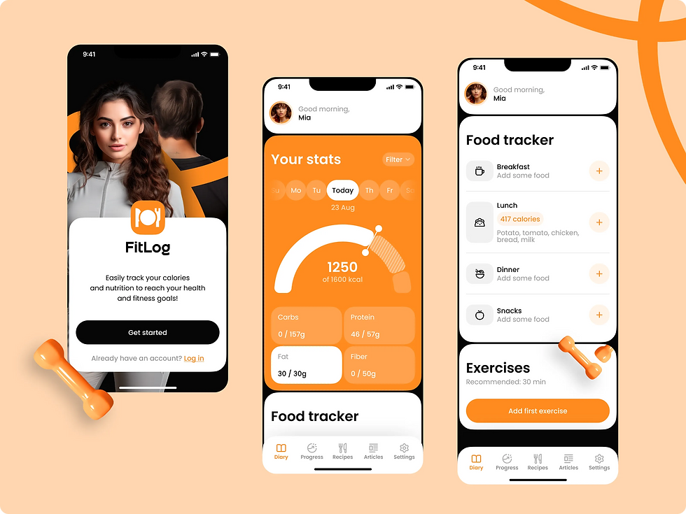
FitLog
FitLog is a mobile app for tracking nutrition, calories, and macronutrients. It helps users stay in control of their diet, achieve fitness goals, and build healthy habits with an intuitive food diary, progress charts, and fitness tracker integration.
Role:
UX/UI Designer
Year:
2025
Introduction
In this project, I was responsible for the full design process: from research to high-fidelity delivery. I started with competitive analysis to identify market gaps and best practices, then developed user personas to capture key audience needs. Based on these insights, I mapped the App User Flow and created a clear information architecture to ensure intuitive navigation.
I translated the structure into wireframes to test usability and refine interactions early on. Once validated, I delivered polished high-fidelity screens and a consistent UI Kit, providing the foundation for scalable product development.
Defining the Problem
Many people struggle to maintain a balanced diet and track their daily nutrition consistently. Existing apps are often cluttered, unintuitive, or too complex for everyday use, which leads users to abandon them quickly.
The challenge was to design a simple yet powerful tool that allows users to log meals effortlessly, monitor calories and macronutrients, and stay motivated on their health journey. The solution needed to balance clarity, usability, and data accuracy, while also providing room for personalization and long-term habit building.
Research & Insights
To better understand the market landscape, I conducted a competitive analysis of the most popular nutrition and fitness tracking apps, including MyFitnessPal, Lifesum, Cronometer, Lose It!, Fooducate, FatSecret, and Foodvisor.
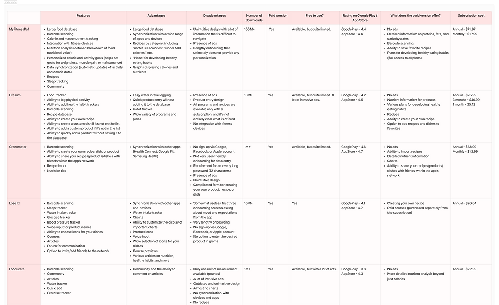
Looking at the competitive landscape, it became clear that while these apps are widely used, they often frustrate the very users they’re meant to support. Long food databases and fitness integrations exist almost everywhere, but the experience is usually weighed down by cluttered design, endless ads, or advice that feels too generic.
From this analysis, I pulled out the main patterns and turned them into key findings that show where there’s room for improvement.
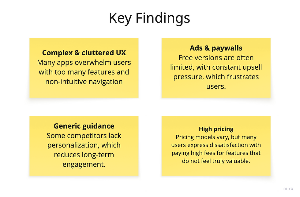
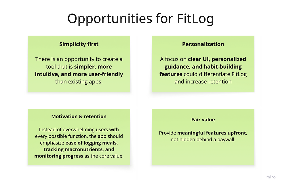
These findings not only revealed common weaknesses across the market, but also pointed to opportunities for creating a more user-centered solution. Building on these insights, I outlined what would become the guiding principles for FitLog.
Through this research, I gained a clear understanding of both user frustrations and market gaps. The competitive analysis highlighted what users value, what drives them away, and where existing apps fail to deliver. These insights became the foundation for FitLog’s design direction, ensuring the product would focus on clarity, personalization, and long-term engagement.
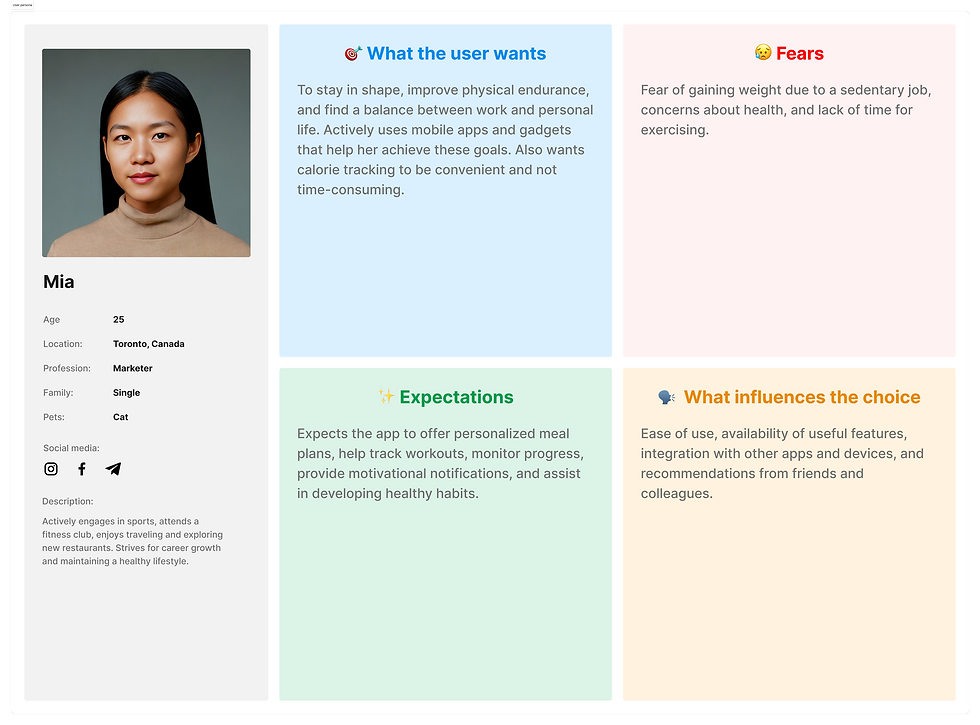
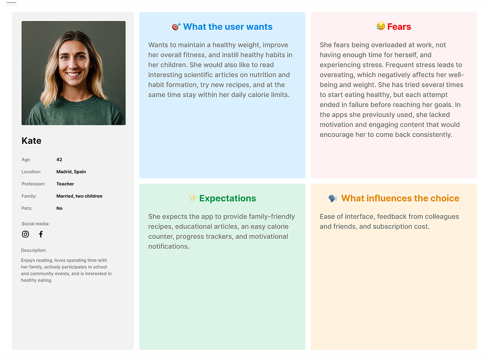
User Personas
After identifying gaps and opportunities in the market, I shifted focus to the people who would actually use the product. To design with empathy and keep decisions user-centered, I created personas that synthesize insights from the competitive analysis, market research, and observed user behavior patterns.
Each persona represents a different type of potential FitLog user — with unique goals, fears, and motivations. These personas became a reference point throughout the design process, ensuring that solutions addressed real needs rather than assumptions.
Mia's problem statement: Mia wants to balance her career, social life, and fitness. While she uses multiple apps and gadgets, she finds calorie tracking time-consuming and wants a quick, personalized solution that helps her stay consistent without overwhelming her.
Kate's problem statement: Kate cares about maintaining healthy habits for her family and herself, but stress and lack of time often lead to relapses. She needs a supportive app that keeps her motivated with simple content and reminders.
Alex's problem statement: Alex works long hours and often overeats at dinner after skipping meals. He needs an app that fits into his routine, supports a calorie deficit, and keeps him consistent without adding stress.
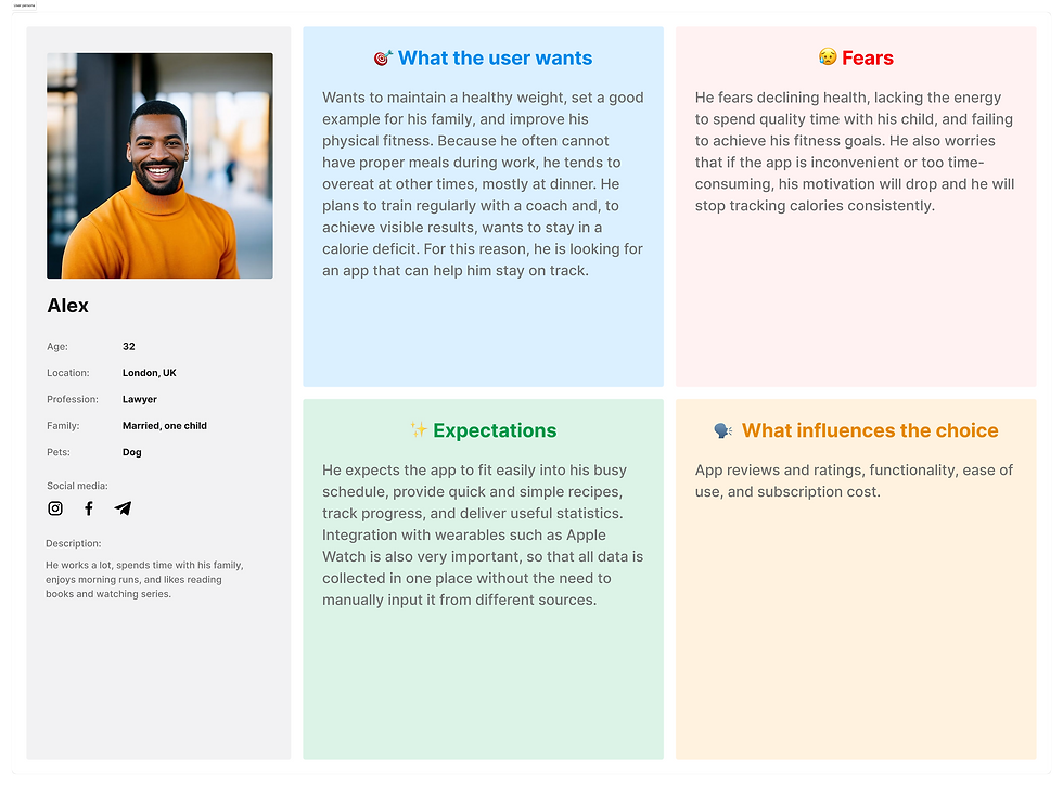
These personas gave me a clear picture of the different types of users FitLog needs to serve — from busy professionals to young, tech-savvy individuals and parents balancing family life. By focusing on their goals, fears, and expectations, I was able to keep the design process user-centered. They became a constant reference point, helping to ensure that every design decision addressed real needs rather than assumptions.
User Flow
Understanding who the users are and what they need made it possible to map out how they would interact with the product. To translate their goals and challenges into a clear experience, I created a User Flow that outlines the key steps and decisions users take when navigating the app.
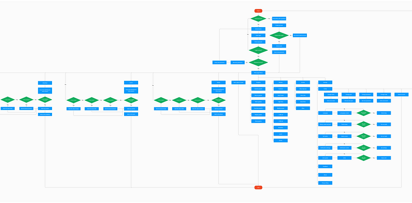
The User Flow helped transform abstract user needs into a tangible journey, showing exactly how different personas would achieve their goals inside the app. It became a foundation for structuring the product, reducing complexity, and ensuring every interaction felt natural and intuitive.
Information Architecture
Once the key user journeys were mapped, the next step was to define how the app’s content and features should be organized. To support smooth navigation and make every action intuitive, I created an Information Architecture that structures the app around users’ goals and priorities.
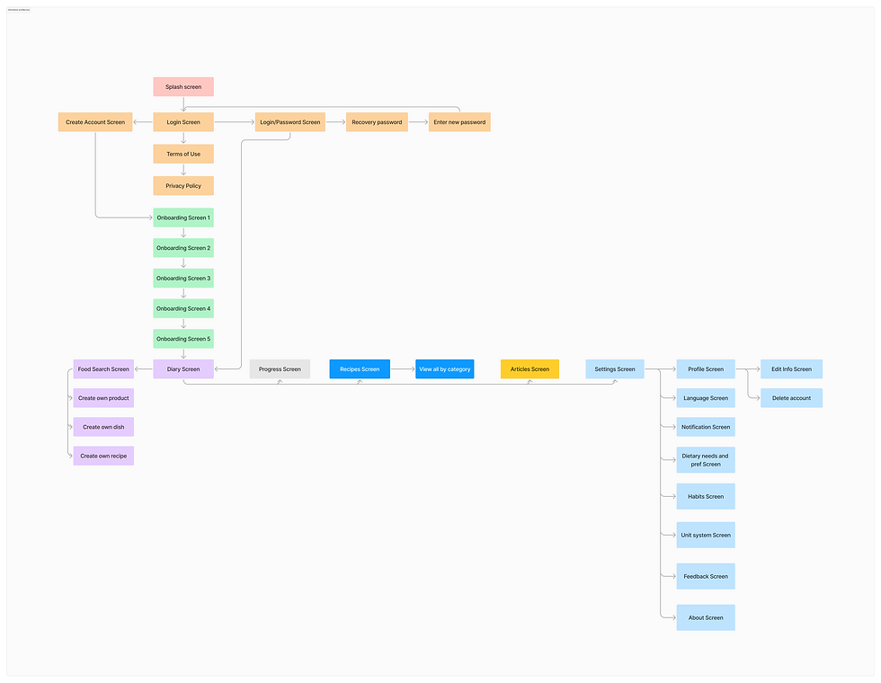
The Information Architecture provided a clear structure for the app, ensuring that every feature and piece of content had its place. It served as the backbone of the design, reducing complexity and laying the groundwork for wireframes and visual exploration.
Low-Fidelity Wireframes
With the structure in place, the next step was to bring it to life visually. I started with low-fidelity wireframes to quickly translate the architecture into screens, test ideas early, and focus on usability without being distracted by visual details.
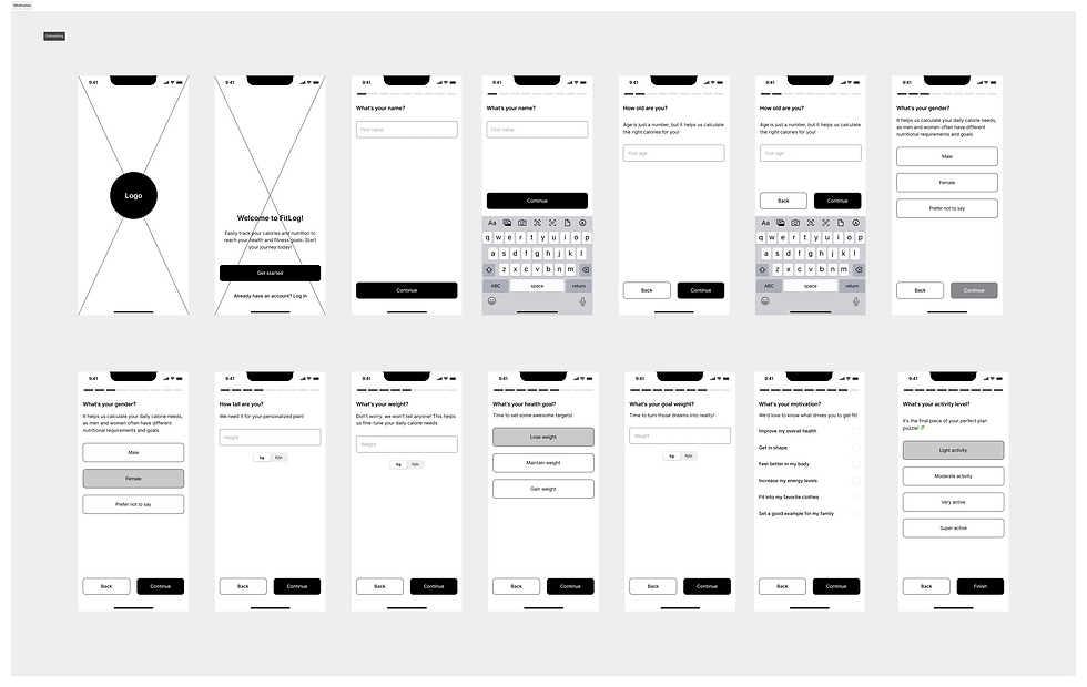
The Information Architecture provided a clear structure for the app, ensuring that every feature and piece of content had its place. It served as the backbone of the design, reducing complexity and laying the groundwork for wireframes and visual exploration.
Usability Testing
To validate the wireframes, I conducted usability testing with potential users representing different personas. The sessions focused on core flows such as meal logging, viewing nutrition statistics, and checking progress.
Objectives:
-
Identify points of confusion or friction in the navigation.
-
Test whether users could complete primary tasks without guidance.
-
Gather feedback on clarity, terminology, and overall experience.
Approach:
I ran remote moderated sessions with 5 participants, combining think-aloud tasks with follow-up interviews. This helped me capture not only what users did, but also how they felt during the process.
Key Findings:
-
Users appreciated the simplicity of the flow but wanted clearer shortcuts for frequent actions (e.g., logging recurring meals).
-
When viewing nutrition statistics, participants wanted clearer visual cues — for example, highlighting when their daily protein, fat, or carbohydrate targets were reached.
-
For checking progress, users asked for a clearer overview of trends over time, such as weekly or monthly summaries, rather than just daily numbers.
Outcome:
The insights confirmed that the core flow was intuitive, while highlighting areas to refine for greater clarity and efficiency. These findings informed the next iteration of the design, which I developed into high-fidelity prototypes for further validation.
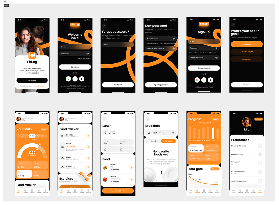
Final Design
With the feedback from usability testing, I refined the flows, simplified the way nutrition data was presented, and improved progress tracking for better clarity. Once these adjustments were in place, I moved on to the Final Design, bringing the product vision to life with polished high-fidelity screens and a cohesive UI kit.
Results and Next Steps
The project showed that a simpler, more focused approach to nutrition tracking resonates with users. Testing confirmed that the core flows were intuitive and engaging, while also highlighting opportunities to improve motivation and data visualization. Next steps include refining personalization, expanding testing with a broader audience, and exploring integrations with wearables to make the experience even more seamless.
This project showed me the value of a user-centered process from research to testing, in shaping a product that feels simple and motivating. For me, great design is about solving real problems and making everyday tasks effortless.